|
Chris Fedderson — MacroFine Musings ~~~~~~~~~~~~~~~~~~~~~~~~~~~~~~~~~~ Orchids and Eagles -- both rare, both beautiful. Last spring we had a bird build a nest in the underside of our second floor deck that stands over our ground floor patio. I think we had been out of town while the nest building was going on, as the bird didn’t seem to know how much daily activity there was going to be on the patio below, and the deck above, her nest. Our cat routinely dines on the second floor deck and then spends time on the ground floor where she wanders about on her leash or lounges in the patio chair that sits right below the nest. And we do plenty of clomping around on the deck during nice weather. Once the bird figured this out the nest was abandoned. After many weeks of watching just to be sure no one was using the nest, we decided to remove it and put it to good use.  Birth of an Orchid This winter as I was looking for new ways to create some great studio shots, I pulled the nest out of the box I had it stored in and went to work. This image, “Birth of an Orchid”, is the beginning of my experimentation with something new and different. I thought I’d try to find a way to capture the stunning attributes of orchids in unique ways and in unusual settings. So far I’ve developed a half dozen images of orchids — each displaying a unique aspect of The Orchid. What better way to Feathering Your Nest than with these unusual orchid images. As I was setting up the photo shoot, I finally examined the nest up close and was fascinated by not only the material but the amount of work that went into this very sturdy nest. It was also heavier than I thought it would be. I believe it’s a Robin’s nest and it’s about 7” across by 3” deep and made with assorted twigs, branches, grasses, leaves, pine needles, and oddly enough, plastic bits. Apparently the Robin also adds mud — made from earthworm poop — to the nest as she is building it to make it sturdy. I’m going to ignore the poop-thing, and still be fascinated by the construction. Birds are amazing nest builders. Some birds use spider silk as threads for their nests. Some build giant colonies of nests like apartment buildings. A bald eagle builds a nest that is 4-6 feet in diameter and may be just as deep. Imagine what kind of crazy studio set up we could do with that! Look out Anne Geddes!  The Eagle Cam at our National Arboretum in DC We live along a highly-trafficked bird migratory route, so we see a huge number of different birds and are continually spotting new species flying near our house. In Huntley Meadows, just a few miles from where we live, over 200 species of birds have been identified frequenting the park. It is a great place to visit, view birds, and see a few nests. Another really exciting development is at the National Arboretum. The Arboretum has a pair of hatchling Bald Eagles this spring for the first time in nearly 70 years! It is a wild eagle pair who are nesting on the grounds, and you can view them on the DC Eagle cam. Hurry, though, before the kids leave home!
Thank You for visiting, — Chris P.s. What unusual pairing of objects not usually associated with each other have you photographed? What have you imagined in your mind’s eye and are looking forward to shooting? Have you seen someone’s work you really admire for its juxtaposition? Share with us in the comments; we’ll trade ideas.
0 Comments
Chris Fedderson — MacroFine Musings [This post is an elaboration on the fifth, and last, point I made in my post of November 10, 2015 Five ways to raise your photo IQ (Interest Quotient)] ~~~~~~~~~~~~~~~~~~~~~~~~~~~~~~~~~~ “There are no rules for good photographs, there are only good photographs.” — Ansel Adams Often at art shows, I get into conversations with patrons about what it is that I see in an image, what I visualize, what makes a “good” photograph, how does one know when a shot will be a good one… etc. There is no easy answer, only you can answer that, and only for you. If there were an easy answer, every car company would have a Mustang and no car company would ever have an Edsel. While you are addressing this question of good-ness, of course you need to heed all the techy-stuff: Is it focused? Is it well-composed? Is it printed well, or show on the monitor well? Is the color correct? Etc. After these things are satisfied, good-ness lies entirely in the eye of the beholder — be that you or your viewer. And obviously, never will we all agree about this for any particular image. In determining good-ness, I feel a good place to start is to ask whether this image has a sufficient “hook”. By “hook” I don’t mean a gimmick or a superficial visual element about which, after the first look, you might say, “Seen that. Done that. Move on, now”. But rather, a hook is the reason the image exists. It is the soul of the image. The emotion, feeling, or message of the image. It is the essence of the image, which will be re-seen, re-lived, and re-felt anew, with each viewing.  Life in the City A hook can be just about anything. It could be the subject (Aunt Millie with her new niece); it can be an element within the image (unusual lighting or juxtaposition); it might be the more mysterious feeling or emotion it elicits. You decide what the hook is, but remember that for each viewer, the hook may be different.
OK, here’s another Ansel Adams quotation: “There are always two people in every picture: the photographer and the viewer”. After all, we each bring our own set of life experiences and memories to the viewing and those ~different~ elements are what determine our individual take-away. Thank You for visiting, — Chris P.s. Think about the various hooks in your images. How might they each, or the general concept directing them, be strengthened? Do they inspire concepts for other hooks? How might you capture this hook-concept; what imagery might facilitate that? Comment about your unique hooks — we’ll talk about them and compare notes. Chris Fedderson — MacroFine Musings Kathy Lawler, Guest Blogger [This post is an elaboration on the fourth point I made in my post of November 10, 2015 Five ways to raise your photo IQ (Interest Quotient)] ~~~~~~~~~~~~~~~~~~~~~~~~~~~~~ 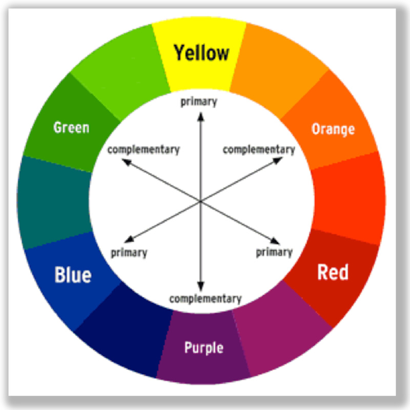 Basic Color Wheel Showing Basic Color Wheel ShowingPrimary and Complementary Colors Color is a complicated subject — I’ve touched on it before — and is one of the five biggies in a photograph — along with focus, composition, lighting, and your hook. There are countless articles you can read on Color Theory; it seems you can spend a lifetime studying color interplay. But it is very helpful to know what colors work well together and why. As we saw recently with the blue/black or white/gold dress fiasco, color is powerful and varied — given how the image is photographed, and on how you, the viewer, interpret the colors. The original dress photo was overexposed and the white balance was off. While this phenomenon was interesting for a few minutes, you don’t want your images to be this misunderstood. Here the basic color wheel shows the relationship between colors. You will find that knowing and considering even the basics of color and color wheels can help make your photos dynamic. Let’s discuss how to use this understanding to your advantage. The language surrounding color can be a mystery so let’s take a look at a few terms that will help you.
How these characteristics work together is what you want to consider to help you to create a dramatic image. The color wheel will help you think about color in an organized way and will explain how colors can be combined for a variety of effects. If you are a nature photographer, the good news is that nature does at lot of this stuff for you, your job is to capture it. For studio work you will need to put a little more consideration into your backgrounds and set-ups. Here is a basic color wheel that shows the relationship between colors. You will find that knowing and considering even the basics of color and color wheels can help make your photos dynamic. Let’s discuss how to use this understanding to your advantage. 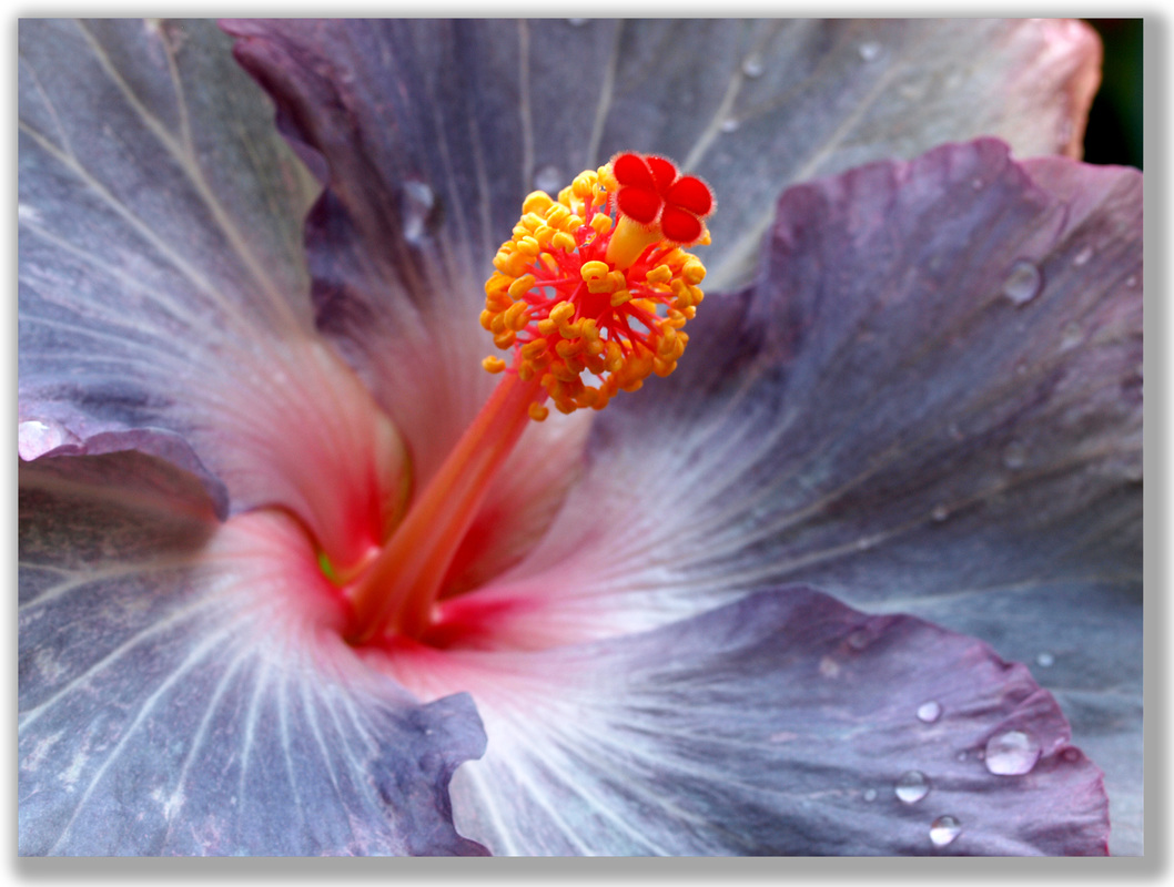 Steel Hibiscus [credit: Chris Fedderson] Yellow/Purple to Blue/Orange color relationships  Red/Green Color Combination Red/Green Color Combination Here are few types of dynamic color combinations to experiment with: Complimentary colors — these are opposite each other on the color wheel and can create striking color combinations. For example, a red flower against green leaves produces a beautiful contrast. 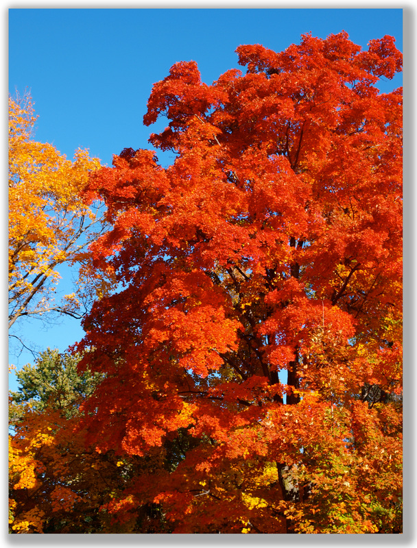 Analogous and Complimentary Colors Analogous and Complimentary ColorsWorking Together Analogous colors are next to each other on the color wheel and are pleasing combinations and often occur in nature. Think of fall leaves: red, orange, and yellow. Now pair that with a blue sky and you have used complimentary with analogous colors. Stunning! Just look here!  Warm (orange) vs. Cool (blue) interaction Warm (orange) vs. Cool (blue) interaction Warm colors vs. cool colors. These can make an object recede or move forward in the image. Imagine how powerful that could be in your image! You may think you don’t have control over the color in your images as you shoot images in nature or how you set up a photo shoot. This is where some color knowledge, and what you consider when shooting, comes into play.
Are you shooting a red flower and your angle has you shooting against dirt? If so, consider adjusting your angle to put a better color combination or a more dynamic one into the background. If you looked at the flower from a different angle — from the right or left or higher or lower — perhaps there is a better background color with which you can compliment the red flower. Are there green leaves in the background on one side if you bend down and shoot from the side rather than from the top? Warm colors, red and yellow for example, will advance in a scene (look to be more in the foreground) vs. cool colors, blues and greens, will recede (appear more in the background). You can see how important considering color combinations is and how they will influence the outcome of your images. These are just a few basic color combination examples, but you will learn as you study color which combinations give you the look you are striving for; the look that is unique to your work. And, as always, breaking the rules after you learn them is what leads to your unique look and feel. And it’s fun. Happy coloring! Thank You for visiting, — Kathy Lawler, guest blogger P.s. Experiment with unusual combinations and tell us how these worked out. What are your favorite color combinations? What do they “do” for you? Have you noticed the occurrence of the use of any color-play in life? [… think Denny’s color scheme] What affect did these uses produce? Chris Fedderson — MacroFine Musings [This post is an elaboration on the third point I made in my post of November 10, 2015, Five ways to raise your photo IQ (Interest Quotient)] ~~~~~~~~~~~~~~~~~~~~~~~~~~~~~~~~~~~~ But not just any light . . . Is it sunlight? Fluorescent light? Candle light? Side light? Back light? Bright light? Diffused light? Colored light? Mottled light? Half-shadowed light? It gets worse… what temperature is the light? I don’t mean is it a hot day or a freezing day, but rather, what is the Kelvin Color Temperature? From Wikipedia: The color temperature of a light source is the temperature of an ideal black-body radiator that radiates light of comparable hue to that of the light source. What does that mean?! Yeah, I don’t know either. At least not in all its Technicolor Glory. In general terms, though, the Color Temperature that White Balance refers to is where a particular light falls on a scale from warm to cool, and covering this fully would be a book in itself. Your camera manual will likely have a chart showing this relationship — at least with regard to how it meshes with your camera’s setting choices. I’ve shown a simple chart here, but if you really want to read in-depth, you might start with Wikipedia or these guys or maybe these other guys. 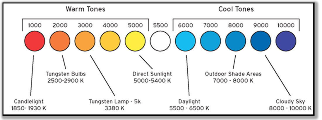 Color 'Temperature' Chart Since I do most of my shooting outside in daylight, and since daylight white balance is probably the easiest color temperature for the camera to determine, I often delegate this chore to the camera’s computer. I use Auto-WB a vast majority of the time. But, I do look at the different WB settings available to see what differences it might make. These shots show the camera overlaying the menu control on the monitor image to give you an indication of what the specific WB setting will produce. It is only an indication, though, so experiment to see how this might enhance your imagery. 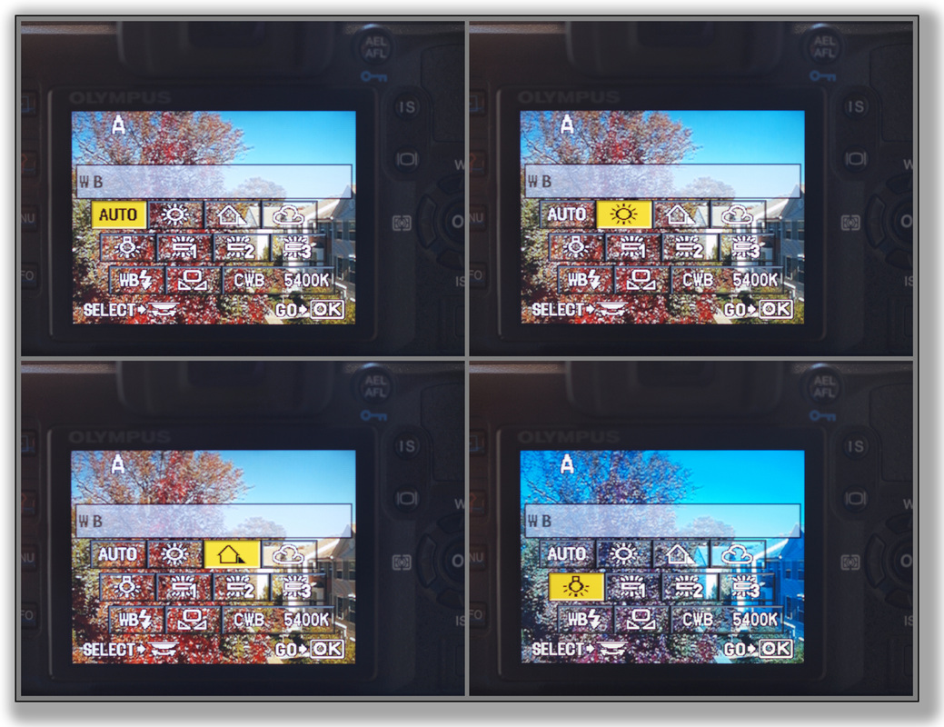 White Balance Settings note the differences in warm vs. cool tones
You can also set a custom WB. Probably most applicable to strict studio work where you don’t have pure daylight but maybe a mix of daylight from a window (a very, variable light source) mixed with artificial light from incandescent or fluorescent lights of who-knows-what temperature, and possibly your flash added in. You’ll find the instructions to do this in your camera manual. So after all that, you decided to just use Auto White Balance? OK, but you’re not out of the woods, yet! There are still potential issues related to an over abundance of — or lack of — light on and around your subject, i.e., the quantity of light.
These problems can all be addressed by one, or both, of two solutions. You need to either add light or you need to reduce light at a given spot. I’m not going to cover flash here — that, too, could be a book in itself — but rather some techniques for rearranging the available light; for bringing light to a subject and for reducing the light falling on your subject. Of course you can buy all sorts of reflectors, shades, umbrellas, diffusers, and don’t even start talking about light sources! But you can also do a very serviceable job with little-to-no expense.
When you want to expand on these light-altering techniques, there are more things you can try: metering tricks, exposure compensation, and of course, flash and other external light sources. So try everything you can think of, and have fun experimenting! 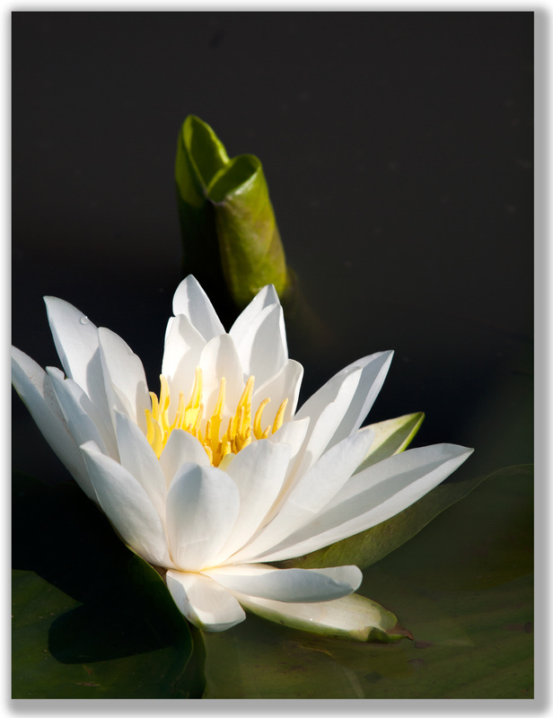 Lily Grace photo Credit: C. Fedderson This image, Lily Grace, shows use of metering to achieve unique lighting. I’ll cover use of metering in a future post . . . So Don’t Touch That Dial!
Thank You for visiting, — Chris P.s. What really Outside-the-Box things did you try? What worked? What didn’t? What gave you great — unexpected — results? What are you going to try next? |
Categories
All

About Chris
I am a Virginia-based photographer and gather my images while hiking in parks and natural areas here at home and in the locations I travel to. I also love to visit arboretums and botanic gardens to find unusual and exotic subjects. Archives
March 2017
|
 RSS Feed