|
Chris Fedderson — MacroFine Musings Kathy Lawler, Guest Blogger ~~~~~~~~~~~~~~~~~~~~~~~~~~~~~ 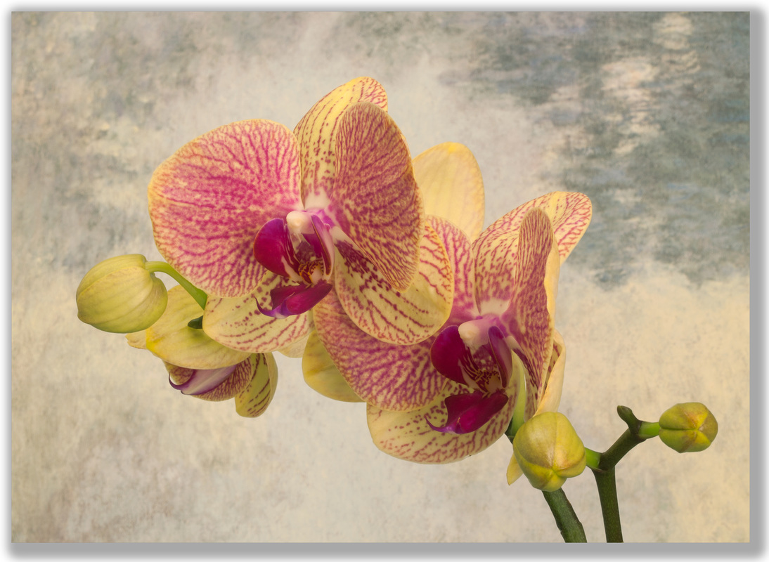 Blooming Impressionist Blooming Impressionist(credit: C Fedderson) It's about that time of year in our household when we are wishing winter was on its way out. Our thoughts are turning to spending time out doors in the sun where we can go on photo safaris to see spring in all its glory. But since we aren’t quite there yet we did the next best thing, brought a little spring home and went to work in the studio. It seems this time of year orchids are for sale just about everywhere. Turns out that orchids, according to the Rainforest Alliance, are the largest plant family in the entire world and there are over 25,000 different species of orchids – no wonder they're everywhere! Orchids have also been the flower we have never before dared to buy, only admiring from afar, for certainly growing them would be way beyond our abilities. But we took the plunge – we now have one – only 24,999 to go! We found this very photogenic variety, Phalaenopsis [fay~len~OP~sis] and we were told it was easy to grow. After getting two beautiful plants home we looked up the care and feeding of these lovelies. According to Missouri Botanical Garden site: “It serves as an excellent houseplant as long as basic growing conditions can be met. Best sites are on east window sills, but plants also grow well on well-shaded south or west sills, with growing conditions that include (a) temperatures at 72-85 degrees F in daytime and above 60 degrees F at night (a temperature drop to 55 degrees F at night in fall helps initiate flower spikes), (b) significant humidity (50-60 % - set pot on moist gravel tray with the base of the pot NOT standing in water and mist in morning), (c) bright light but no direct sun, (d) good air movement (ceiling fan is ideal), and (d) a potting mix of coarse fir bark or orchid bark mix that facilitates circulation of air and water. Plants will tolerate some brief temperature extremes, but temperatures in excess of 95 degrees F or below 55 degrees F should be avoided. Water thoroughly with tepid water in mornings only.” … OH REALLY!!!! It goes on and on from here! No wonder the name starts with the sound Phal (fail). Good news for all of us is that there are a number of beautiful orchids shows going on right now and we can visit and admire all sorts of varieties to our hearts content and not feel the least bit compelled to take home a living plant. The other great news is that you can visit the Workhouse Art Center in Lorton in March (March 9th through April 3rd) to see Chris’ excellent and unusual photos of orchids. These require no feeding or maintenance and will bring even more enjoyment to your home than the real (really hard to care for) thing.  Orchid Shores [credit: C Fedderson] As you can see we had a great time in the studio trying new approaches to photographing orchids by raiding the cupboard for props and accentuating the natural beauty that is ... The Orchid.
Doesn’t mean we aren’t still waiting for spring. Thank You for visiting, — Kathy P.s. Have you tried to keep Orchids? How did you succeed? What's your favorite variety? Let us know in the comments how you overcame any problems... we'll compare techniques. And do be sure to come see Chris' Orchid Ovation show along with all the great Artwork on exhibit by the other great Associate Artists at the Workhouse, building 9.
2 Comments
Chris Fedderson — MacroFine Musings Kathy Lawler, Guest Blogger [This post is an elaboration on the fourth point I made in my post of November 10, 2015 Five ways to raise your photo IQ (Interest Quotient)] ~~~~~~~~~~~~~~~~~~~~~~~~~~~~~ 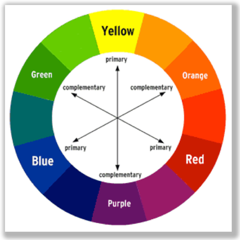 Basic Color Wheel Showing Basic Color Wheel ShowingPrimary and Complementary Colors Color is a complicated subject — I’ve touched on it before — and is one of the five biggies in a photograph — along with focus, composition, lighting, and your hook. There are countless articles you can read on Color Theory; it seems you can spend a lifetime studying color interplay. But it is very helpful to know what colors work well together and why. As we saw recently with the blue/black or white/gold dress fiasco, color is powerful and varied — given how the image is photographed, and on how you, the viewer, interpret the colors. The original dress photo was overexposed and the white balance was off. While this phenomenon was interesting for a few minutes, you don’t want your images to be this misunderstood. Here the basic color wheel shows the relationship between colors. You will find that knowing and considering even the basics of color and color wheels can help make your photos dynamic. Let’s discuss how to use this understanding to your advantage. The language surrounding color can be a mystery so let’s take a look at a few terms that will help you.
How these characteristics work together is what you want to consider to help you to create a dramatic image. The color wheel will help you think about color in an organized way and will explain how colors can be combined for a variety of effects. If you are a nature photographer, the good news is that nature does at lot of this stuff for you, your job is to capture it. For studio work you will need to put a little more consideration into your backgrounds and set-ups. Here is a basic color wheel that shows the relationship between colors. You will find that knowing and considering even the basics of color and color wheels can help make your photos dynamic. Let’s discuss how to use this understanding to your advantage. 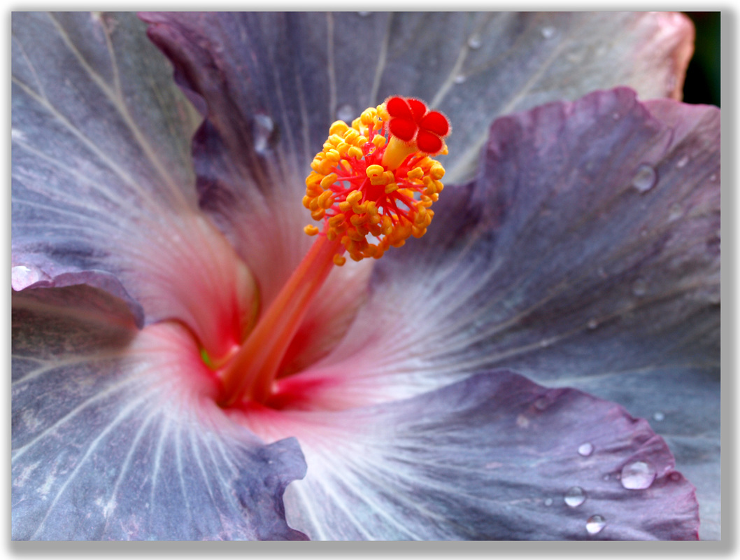 Steel Hibiscus [credit: Chris Fedderson] Yellow/Purple to Blue/Orange color relationships  Red/Green Color Combination Red/Green Color Combination Here are few types of dynamic color combinations to experiment with: Complimentary colors — these are opposite each other on the color wheel and can create striking color combinations. For example, a red flower against green leaves produces a beautiful contrast. 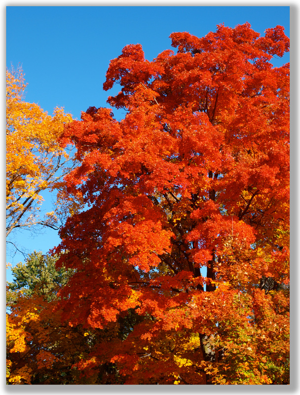 Analogous and Complimentary Colors Analogous and Complimentary ColorsWorking Together Analogous colors are next to each other on the color wheel and are pleasing combinations and often occur in nature. Think of fall leaves: red, orange, and yellow. Now pair that with a blue sky and you have used complimentary with analogous colors. Stunning! Just look here! 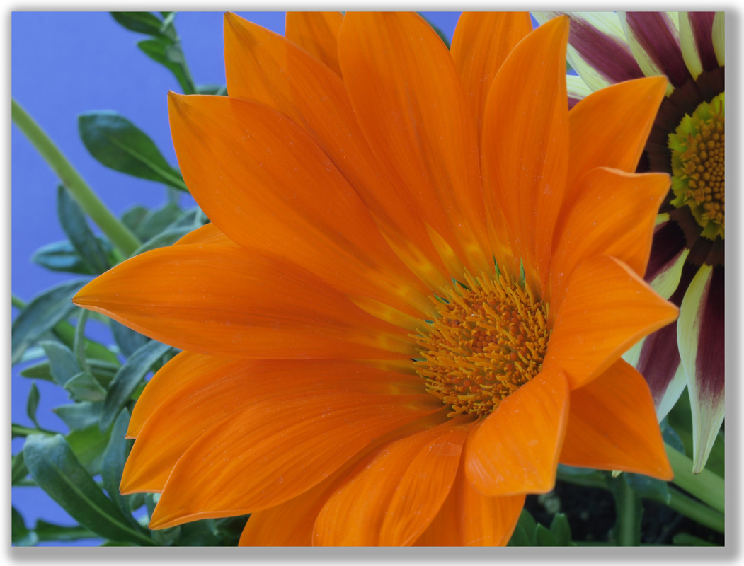 Warm (orange) vs. Cool (blue) interaction Warm (orange) vs. Cool (blue) interaction Warm colors vs. cool colors. These can make an object recede or move forward in the image. Imagine how powerful that could be in your image! You may think you don’t have control over the color in your images as you shoot images in nature or how you set up a photo shoot. This is where some color knowledge, and what you consider when shooting, comes into play.
Are you shooting a red flower and your angle has you shooting against dirt? If so, consider adjusting your angle to put a better color combination or a more dynamic one into the background. If you looked at the flower from a different angle — from the right or left or higher or lower — perhaps there is a better background color with which you can compliment the red flower. Are there green leaves in the background on one side if you bend down and shoot from the side rather than from the top? Warm colors, red and yellow for example, will advance in a scene (look to be more in the foreground) vs. cool colors, blues and greens, will recede (appear more in the background). You can see how important considering color combinations is and how they will influence the outcome of your images. These are just a few basic color combination examples, but you will learn as you study color which combinations give you the look you are striving for; the look that is unique to your work. And, as always, breaking the rules after you learn them is what leads to your unique look and feel. And it’s fun. Happy coloring! Thank You for visiting, — Kathy Lawler, guest blogger P.s. Experiment with unusual combinations and tell us how these worked out. What are your favorite color combinations? What do they “do” for you? Have you noticed the occurrence of the use of any color-play in life? [… think Denny’s color scheme] What affect did these uses produce? 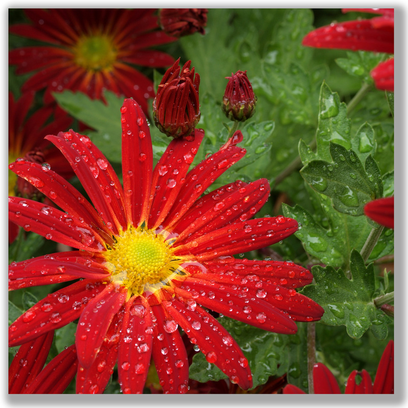 A Daisy Chrysanthemum A Daisy ChrysanthemumPhoto Credit: C. Fedderson Chris Fedderson — MacroFine Musings ~~~~~~~~~~~~~~~~~~~~~~~~~~~~~~~~~~ If you take a flower in your hand and really look at it, it's your world for the moment. — Georgia O'Keeffe, (1887-1986) Flowers are amazing. From the intricate ways they work with pollinators to ensure fertilization, to the outlandish measures — and mechanisms — they use to trap food (carnivorous plants), to the range of fragrances (stenches?) that they exude, to the endless variations in their appearance, to the… Even the ‘simple’ daisy is really not so simple. Back in high school biology with Mr. Stanford (one of the best teachers of the day, by the way, in case his family is reading) I learned that daisies and the like are in the family Compositae meaning composite flowers. Apparently, botanists are now referring to this family as Asteraceae. According to Wikipedia, these flowers have a flower head that “is a special type of inflorescence, in which anything from a small cluster to hundreds or sometimes thousands of flowers are grouped together to form a single flower-like structure”. So ‘a’ daisy is really a bazillion daisies. Who knew? What is equally intriguing is how we interpret flowers; what meanings we give to them. We all know what he means when he brings you a dozen red roses. But what of a single yellow rose or a white rose or… shudder… a black rose. Here, the rose is the messenger we employ to deliver our sentiments. But we also have attributed significance and symbolism to flowers that are more ethereal, meant to speak directly to the viewer rather than to be used to convey a message to another person. We have done this with Passion Flowers. I always thought the name had something to do with Love or Lust or an extreme attachment to, or involvement with, someone or something. Maybe it meant that if they grew wild in your yard then someone really loved you … or something like that. So I Googled it… Turns out all the various parts — the stigmas, the anthers, the pistils, the petals, — were likened to various aspects of the Crucifixion of Christ. Yikes! Mighty heady message for a flower to bear! So, here’s the deal… According to the website LocalHarvest, “The spiraled tendons of the plant, he” (Patrick Jesse Pons-Worley, author of The Passionfruit Cookbook) “notes, were taken as symbols of the lashes Christ endured, and the central flower column as the pillar of the scourging. The 72 radial filaments of the flower were seen as the crown of thorns; the three stigmas as symbols of the nails used in the crucifixion, as well as the holy Trinity; the five anthers, as the five wounds of Christ; and the style as the sponge doused in vinegar used to moisten Christ’s lips. Taken together, the five petals and five sepals were used to refer to the ten apostles who did not either betray or deny Christ. The fragrance of the flower, continued Pons-Worley, helped recall the spices used to embalm the body of Christ. Finally, its globular egg-size fruit was taken as a symbol of the world that Christ saved through his suffering.” Additionally, the site Passion Flower Basket says, “The dark spots under the leaves represent the 33 pieces of silver that the Romans paid Judas for betraying Christ. When the passion flower has bloomed and spent its energy in a day (the time that Jesus suffered on the cross), the petals do not fall off but close around the ovary. To Catholics, this represents the hidden mysteries of the cross and the entombment of Christ after his crucifixion. Extending the analogy even further, the passiflora’s round fruit symbolize the world that Christ came to save and its red stains the blood of Christ shed with the crucifixion.” 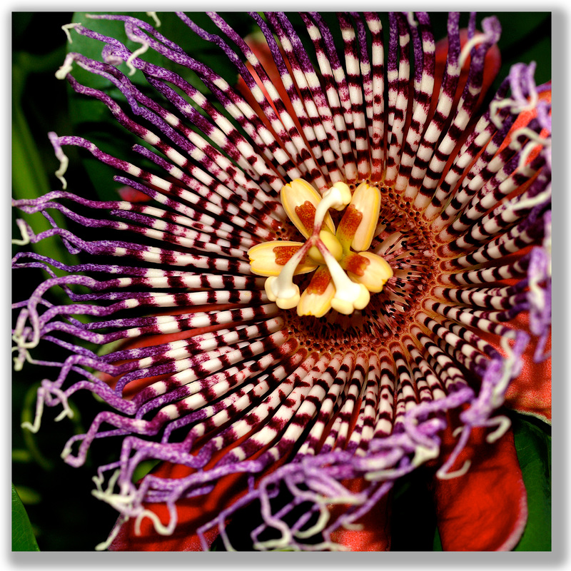 Tapestry Photo Credit: C. Fedderson So, there you have it. The most intricate and heady an attribution I have ever heard of being assigned to a flower. I enjoy them simply for their ridiculous physical complexity. All the crazy parts and colors. Wow!
Thank You for visiting, — Chris P.s. What is your favorite flower? Why? Does it have a special significance relating to your life? Do you just find it pleasing to look at or smell? Is it that you enjoy the butterflies or animals it attracts. Do you know of another story of attribution-to-a-flower like the one for Passion Flowers? Or Dudes, maybe you like ‘em just cuz ‘Chicks dig flowers’…? ;-D Let us know your thoughts and we’ll all compare notes. Chris Fedderson — MacroFine Musings ~~~~~~~~~~~~~~~~~~~~~~~~~~~~~~~~~~ I recently joined the Workhouse Art Center in Lorton, Virginia. To paraphrase the mission statement: The Workhouse Arts Center will provide “a unique arts center that provides visual and performing arts, arts education, and entertainment for the community at large”. Why “Workhouse”? The facility was built in the early part of the 20th century as a prison/workhouse for Washington DC’s non-violent criminals. Included in the prison population were “criminal” members of the National Women’s Party, incarcerated for picketing the White House campaigning for women’s voting rights. 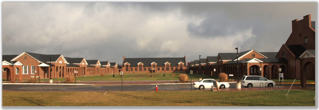 The Workhouse Art Center, Lorton, Virginia So the facility continues its life as a workhouse… this time as an art-Workhouse. The Workhouse hosts scads of special events, programs, classes, lectures, etc., throughout the year together with our monthly Open House, Second Saturday, with many Gallery/Studios hosting individual programs. On a more day-to-day level, the Workhouse currently houses approximately 60 visual artists, working in a variety of mediums, many creating their work in on-site studios located in the former prison blocks, all re-designed and remodeled to accommodate each specific medium. These studios are open for you to visit, to watch the artists creating, and to purchase original artwork directly from the creating artist! Each building also hosts a retail gallery of its own where you may purchase original Works Of Art by the Artists on site. We have artists creating in glass, ceramics, painting, batik, photography, mixed media, fiber, performing arts, and movement (Pilates and Yoga) to name a few. The group I’m a member of are the Associate Artists. We don’t have studio spaces on-site — we produce our art elsewhere — but we have a gallery on-site in Building 9 where we host ever-changing, month-long exhibits of our members’ work. In addition, we also host extended exhibitions of a dozen or so pieces, all created by one of our members as a Featured Artist. With these more extensive exhibits, you can really get a feel for the Artist’s personal perspective. 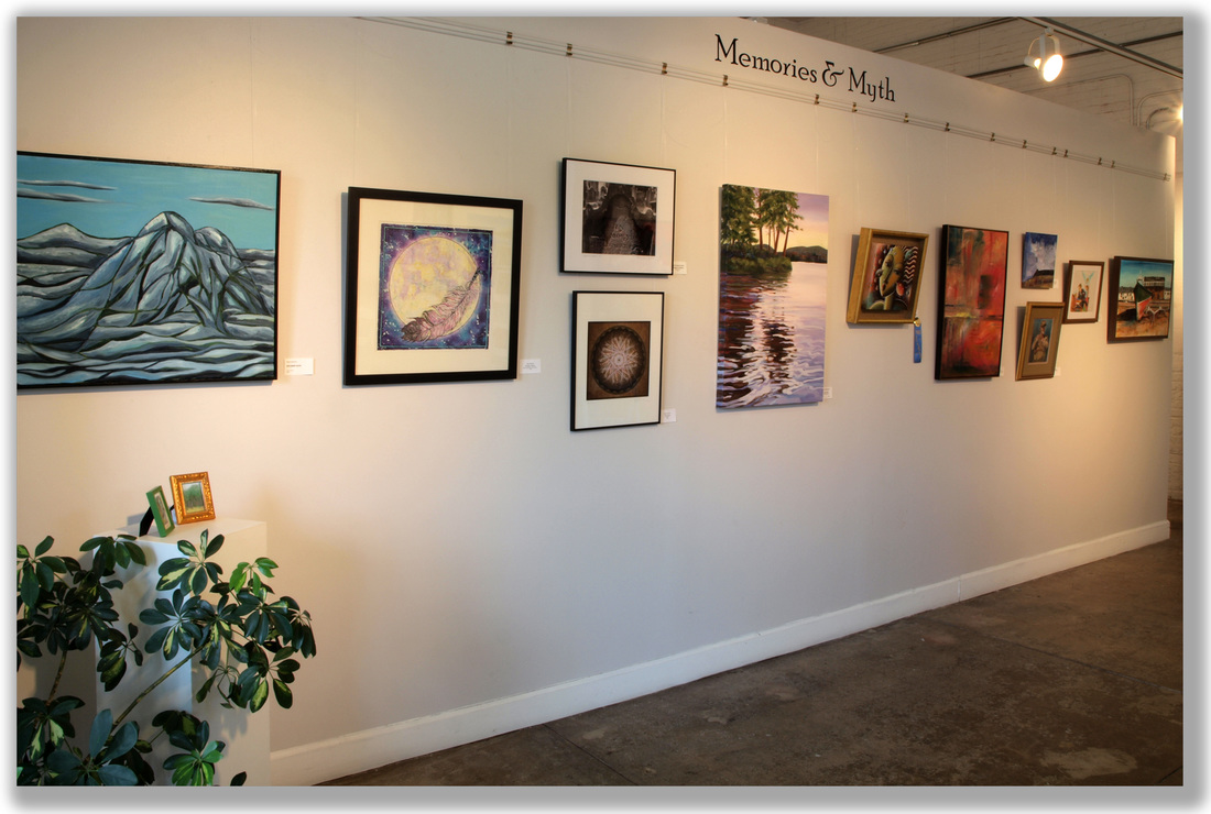 The Featured Artist Exhibit, featuring all the Associate Artists One of the things we do in our gallery on Second Saturdays is hold the People’s Choice Awards. We invite all of our guests to vote for their favorite piece of Art in our gallery. In January (2016) Nancy Hannans won first place, and in a tie for second place with Kathy Strauss was Yours Truly for my image Nature’s Fireworks. 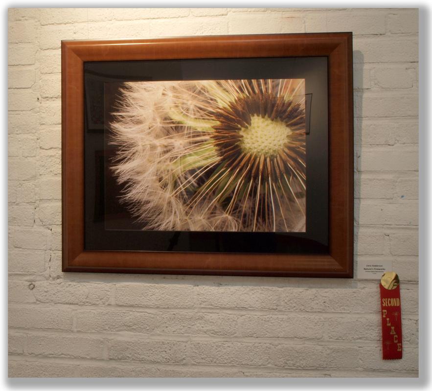 NATURE'S FIREWORKS Chris Fedderson Our members create mostly in 2-D (painting, photography, batik, etc.), but we also show some 3-D fiber arts, notecards, and jewelry, and we also offer very affordable matted print reproductions of many of our art pieces.
If you live in Northern Virginia, or are planning to visit, make a point to come visit the Workhouse. Visit the Workhouse Prison Museum on-site for a fascinating — and sobering — glimpse into a bit of our local history and backstory. Then, visit the Associate Artists’ gallery in Building 9, along with all the other working galleries in the other buildings, and come away with a special bit of original art you were able to purchase directly from the Artist/Creator. Thank You for visiting, — Chris P.s. What experience from your recent visit to the Workhouse did you find particularly illuminating, interesting, inspiring, poignant, sobering, informative, fascinating, thought-provoking, inspirational, intriguing, motivating… Share and we will all benefit from your insight. |
Categories
All

About Chris
I am a Virginia-based photographer and gather my images while hiking in parks and natural areas here at home and in the locations I travel to. I also love to visit arboretums and botanic gardens to find unusual and exotic subjects. Archives
March 2017
|
 RSS Feed